PathPilot
PathPilot is a level-3 semi-autonomous e-bike concept that aims to provide a seamless experience for the new advanced technology. In this project, my team explored the relationship between the digital interface and the physical e-bike, what potential values we can bring to users, and how to introduce this concept to new users.
Objective
User Experience with Level-3 Autonomy
Level-3 autonomous vehicles essentially allow users to drive hands-free until the system cannot handle the situation, which will result in the system asking the user to take over control.
For this project, our goal is to create new controls and new paradigms for electric bicycles that test this technology.
Research & Testing
Uncovering User Needs
In the early phase of the project, we conducted guerilla research and semi-structured interviews to identify existing user needs for e-bikes. As we advanced to crafting our paper and digital prototypes, we gradually unveiled additional latent needs through usability tests.
User Research Findings
E-bike security
Through our early research, many e-bikers have told us their fear or experience of their e-bikes being stolen due to its high cost.
Battery usage
Users wanted more information regarding the battery status of their e-bikes since it was crucial to the riding experience.
Usability Test Findings
Introducing the novel concept of level-3 autonomy
As we tested our prototypes, participants struggled to deal with the take-over moment and understand how autonomous mode differs from pedal assist.
Optimizing e-bike controls
Users reflected the need for intuitive and accessible controls during our usability tests.
Design Outcome
High-Fidelity Prototype
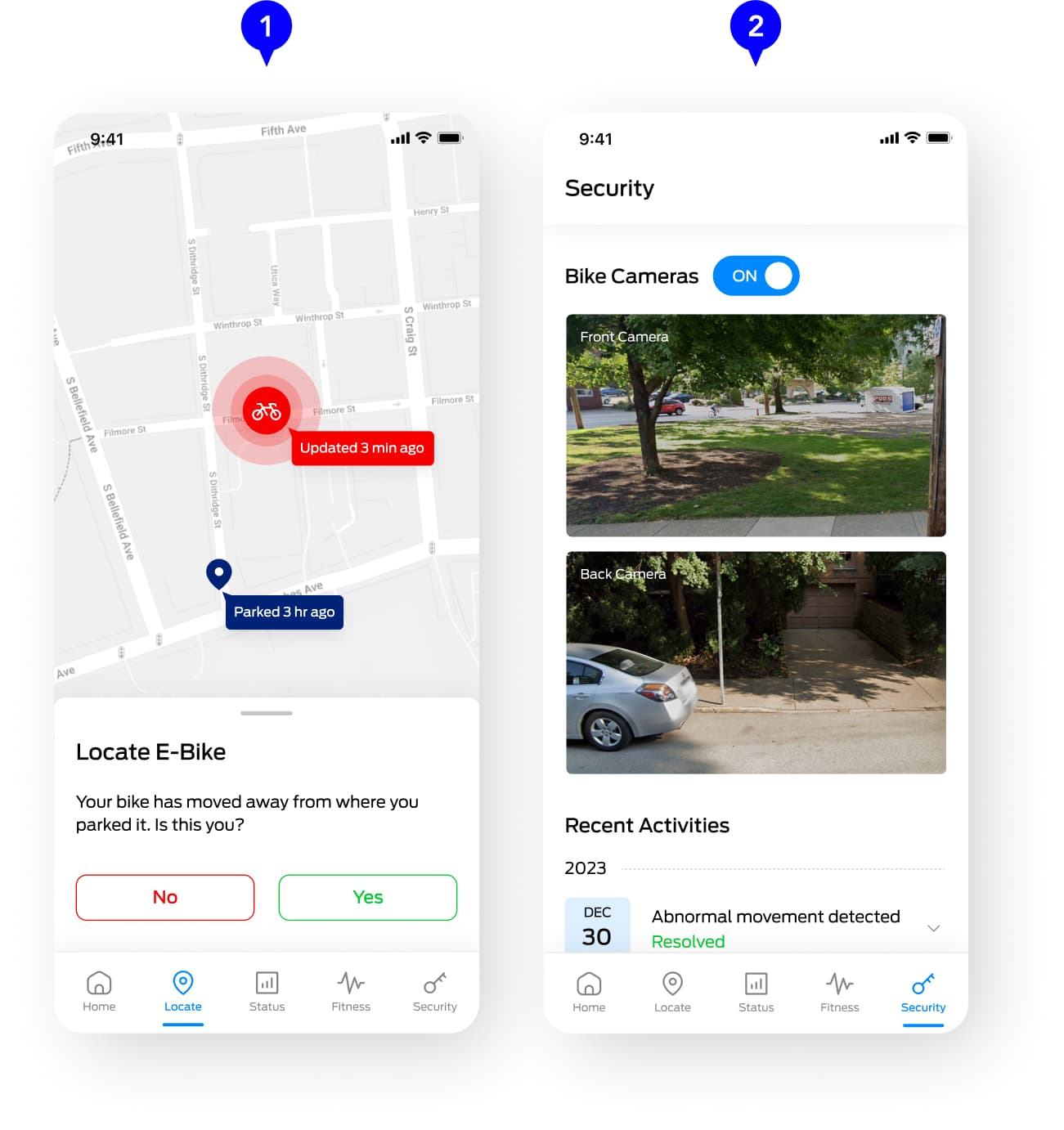
Feature 01 - Mobile App
E-Bike Security
While the primary focus of the vehicle's autonomous feature lies in self-navigation, we explored how autonomy might also be used in providing security to the e-bike.
- Leveraging the e-bike's GPS, users can track the locations of the e-bikes in case of theft.
- If the system detects abnormal motions of the e-bike, it will notify the user, enabling them to check on their e-bikes through the cameras.
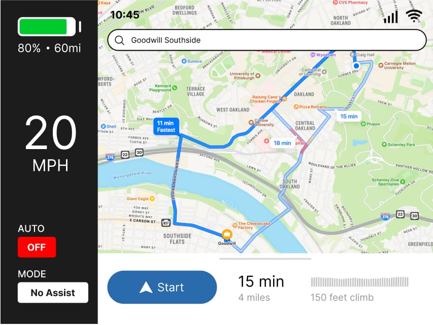
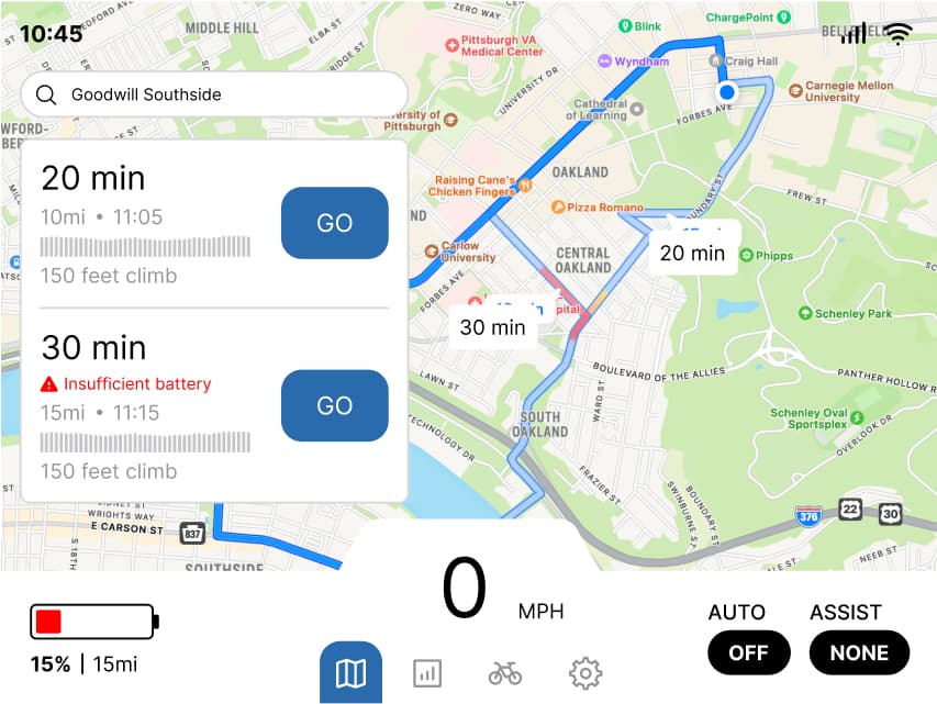
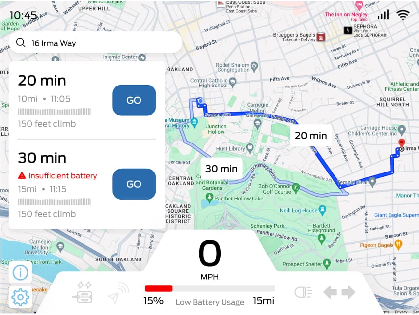
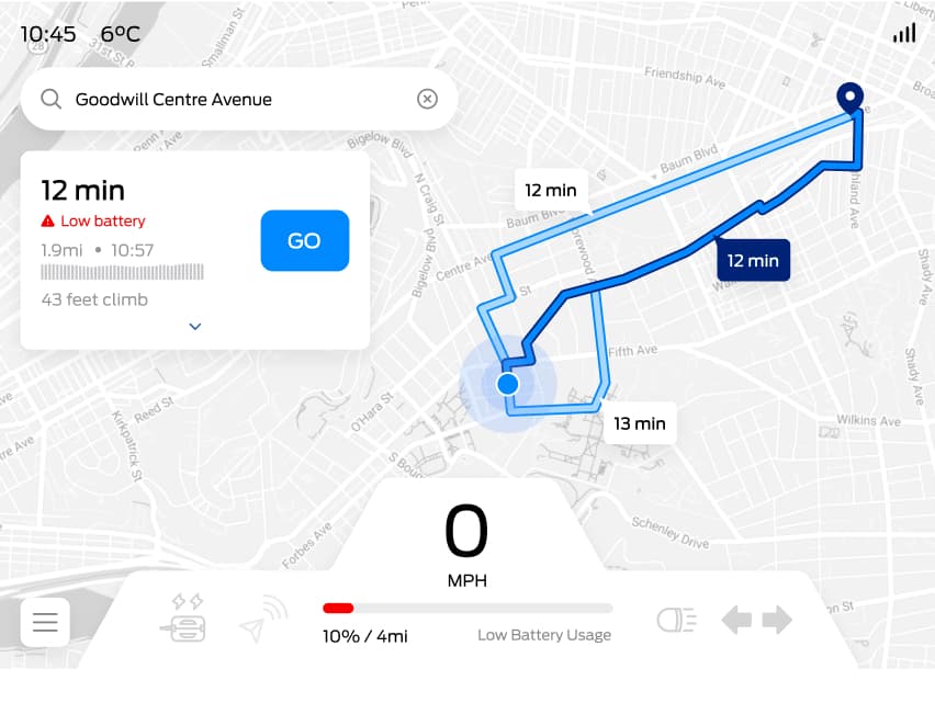
Feature 02 - Dashboard
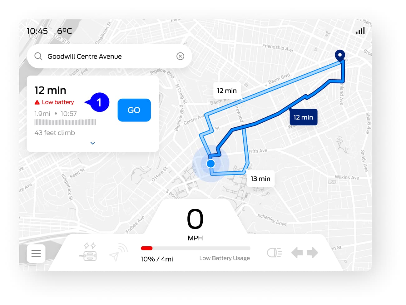
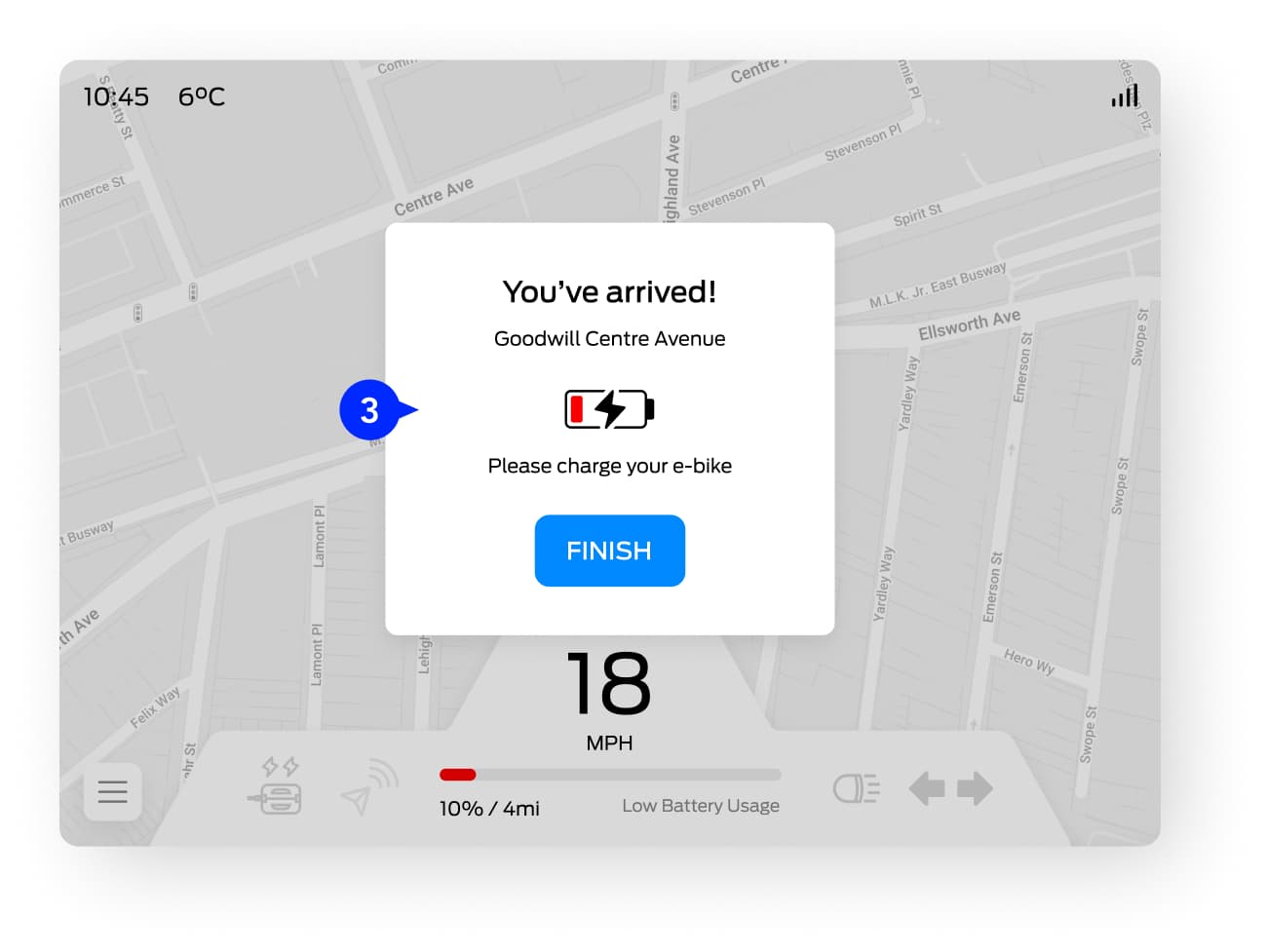
Battery Usage
Aside from providing battery statistics in the mobile app, we primarily focused on investigating how the autonomous feature might impact the use of battery and influence decision making.
- Before travel, the system will let you know if there's sufficient battery for the trip based on the current settings.
- During the trip, if the user changes pedal assist or autonomous mode that might use more battery power, the system will warn the user.
- After reaching the destination, the system will remind the user to charge the e-bike.

Feature 03 - Dashboard
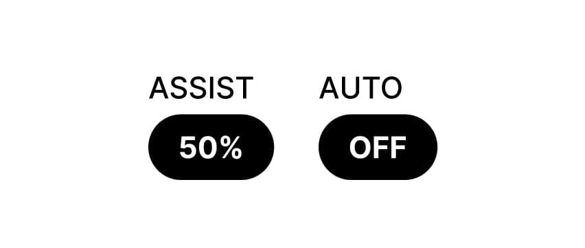
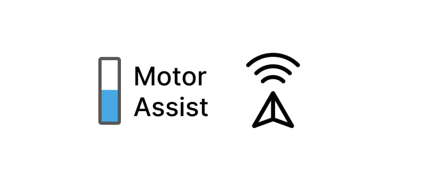
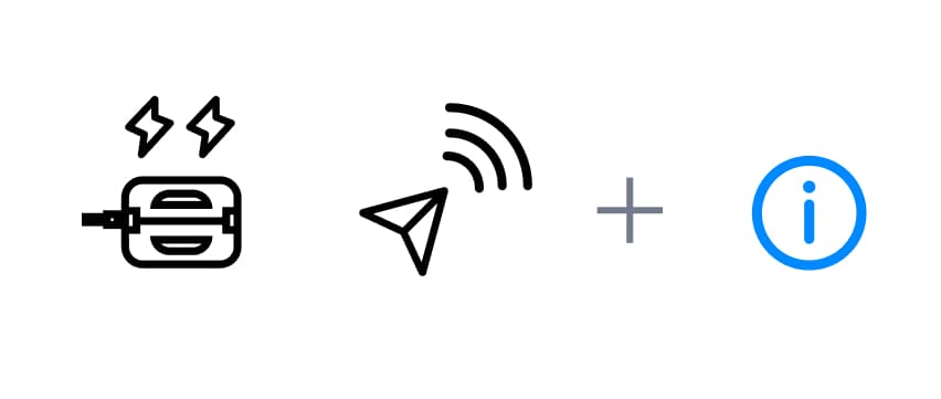
Pedal with Autonomous Mode
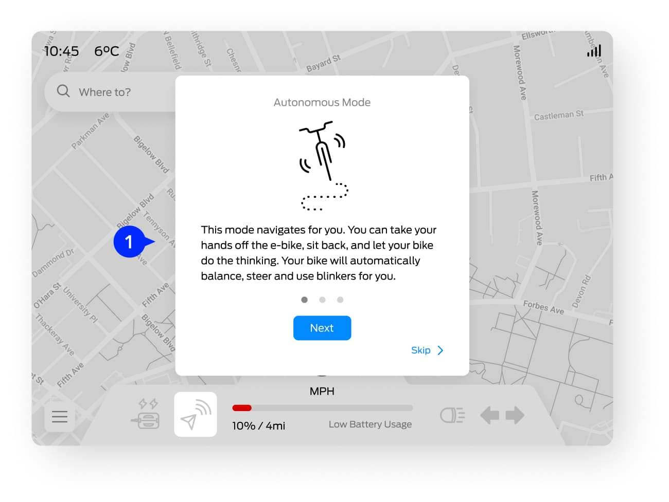
One of the features that distinguishes e-bikes from other vehicles is pedaling. We decided to maintain pedal assist independent from autonomous mode to give users the freedom to experience this unique characteristic. Throughout this project, users had difficulty understanding the difference between the two as we iterated on methods to distinguish them and educate new users of their distinct purposes.
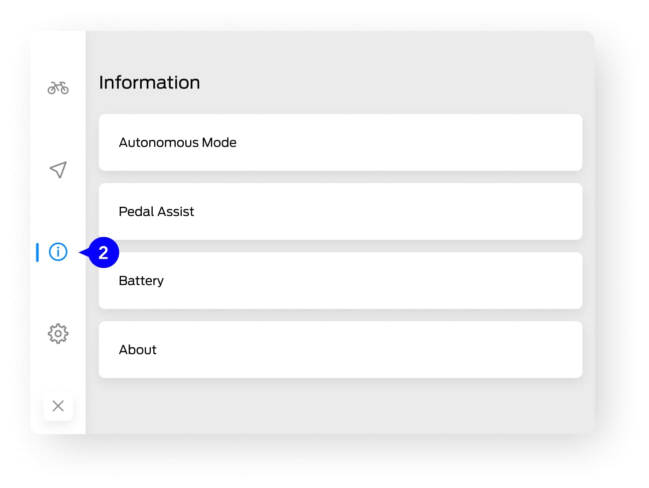
- Despite designing diverse variations of the icons for the two features, user understanding was still limited due to the absence of conventions. Hence, we designed a tutorial for users when they first use the e-bike.
- The tutorials are conveniently accessible through the dashboard's Information page for future reference.
Feature 04 - Dashboard
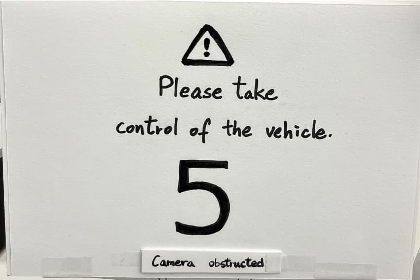
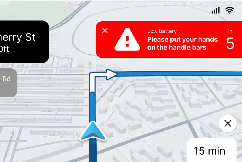
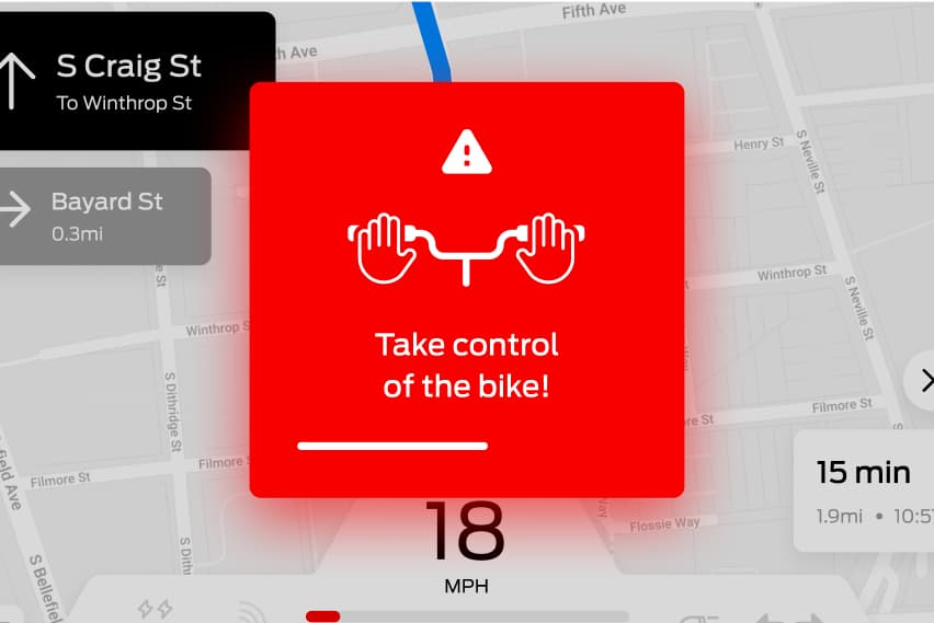
The Take-Over Moment
The take-over moment can be extremely stressful and dangerous for bikers. Our main challenge was to create a warning signal that strikes a balance between being attention-grabbing and not panic-inducing.
- The eye-catching mid-sized warning is placed at the center of the dashboard, featuring graphical instructions to minimize the cognitive load on users.
- Instead of a countdown timer, a shrinking bar appears at the bottom that indicates its limited time for user response, implying urgency with minimal distraction from instructions and alleviating the sense of imminent danger that could induce panic.
- If the user doesn't react in time, the e-bike will gradually slow down to a stop.


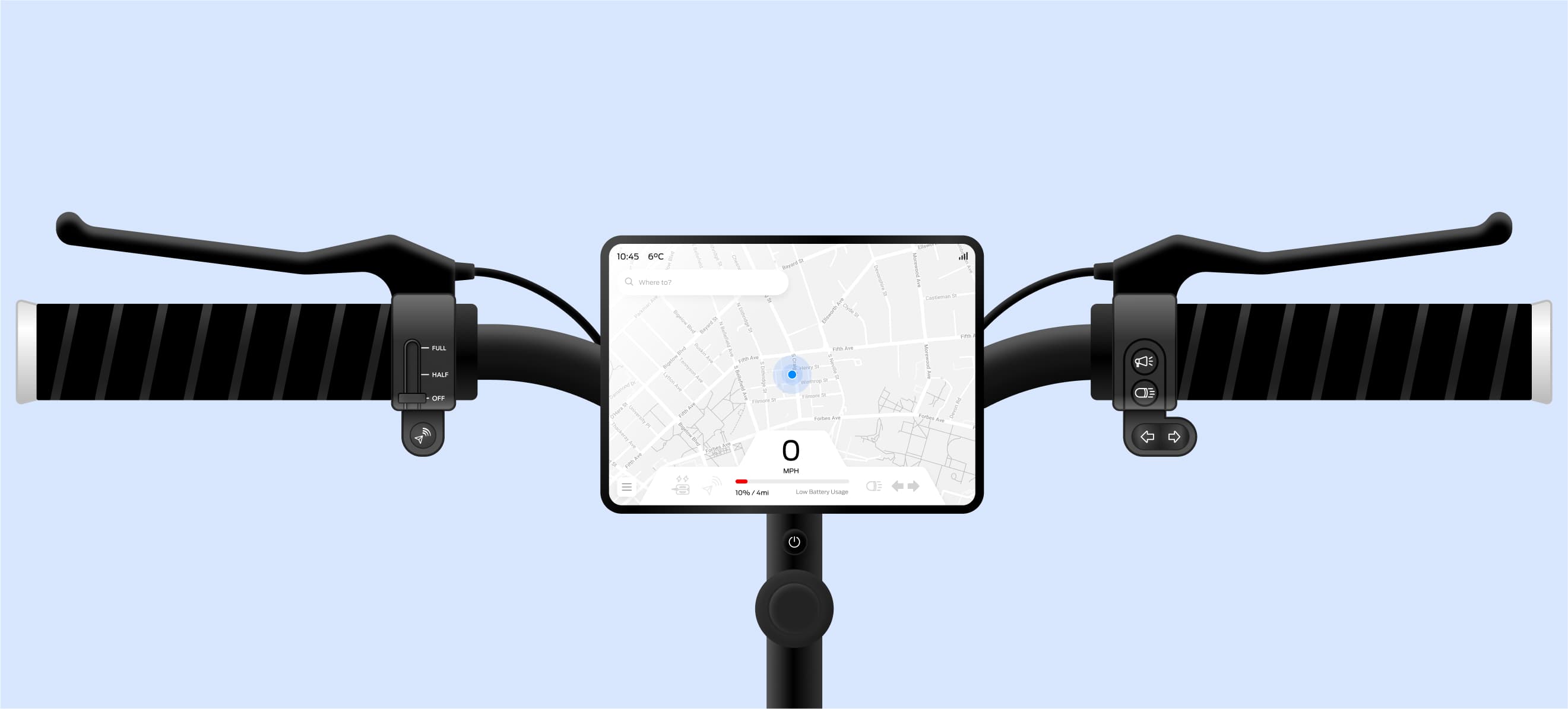
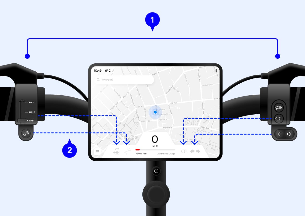
Feature 05 - Physical Controls
Optimizing E-Bike Controls
Our goal was to create discoverable, accessible and intuitive controls that would allow users to grasp controls easily.
- All controls are located within the inner bar close to the thumbs, where users can access without moving their entire hands which could potentially cause danger.
- The positions of the controls map the placement of their indicators on the dashboard, ensuring an intuitive user experience.
Process
Design Iterations
Building a Cohesive Interface
The map was the most integral part of our design for navigation. We aimed to keep the map the largest portion of the interface while providing the best visual experience in the small display.
Iteration 1
Segmented the interface for different purposes, but resulted in a very disjointed viewing experience where each segment felt restricted.
Iteration 2
Implemented to a horizontal layout to improve readability and introduced floating blocks, providing a more spatial and interconnected feel to the interface.
Iteration 3
Further expanded the visibility of the map by adjusting the bottom bar, enhancing the visual experience.
Final Version
Decluttered the interface by hiding non-critical elements and simplifying the color scheme.
Warning Without Inducing Panic
We continuously redesigned the takeover warning as we struggled to find the balance between being eye-catching but not panic-inducing. Over the course we had received feedback on either it's too big, too small, illegible or confusing.
Iteration 1
While we aimed for a prominent warning signal, users expressed that a full-screen warning might induce panic. Furthermore, the term “take control” was unclear and they didn't know what to do.
Iteration 2
We minimized the warning to show up in the corner, but users found it too small to notice. In addition, the descriptive text was challenging to read during the counting down.
Final Version
We chose a mid-sized, eye-catching warning on top of an overlay. To facilitate quick comprehension, we opted for graphical instructions, and replaced the countdown with a shrinking bar to minimize distraction.
Introducing Autonomous Mode and Pedal Assist
Through our usability tests we discovered that users had trouble differentiating autonomous mode with our autonomous feature that handles navigation and balancing. In their mental model, “autonomous” entails the vehicle moving on its own, which is not consistent with our design. Hence, we experimented various ways to convey the differences accurately to users.
Iteration 1
Based on our study, pedal assist was a standard feature on e-bikes, and we assumed simple labels would suffice even with the addition of autonomous mode. Yet, users expressed confusion about the two.
Iteration 2
We tried changing the name or using an icon to represent their functionalities would improve understanding, but realized the novelty of these features meant that there were no conventional designs for users to instantly recognize.
Final Version
Ultimately, we found the most effective way to educate users was through words. We decided to adhere to the consistency of using icons, but with the addition of an in-app tutorial for the users to learn from.