Volcabno
Volcabno is a vocabulary tool concept I designed based on my vocabulary memorizing habits when preparing for TOEFL. At the time, none of the available apps fit how I memorized and tracked vocabulary. Thus, I created a simple prototype to help me get through the test, and I later decided to flesh out its design and structure.
Objective
Personalized Vocabulary App
During my journey of learning new English vocabularies through different methods, none of which truly aligned with my preferred memorization techniques. Hence, I wanted to create a vocabulary app tailored to my specific needs and habits for enhanced convenience and learning experience.
Context
Unmet Needs with Current Methods
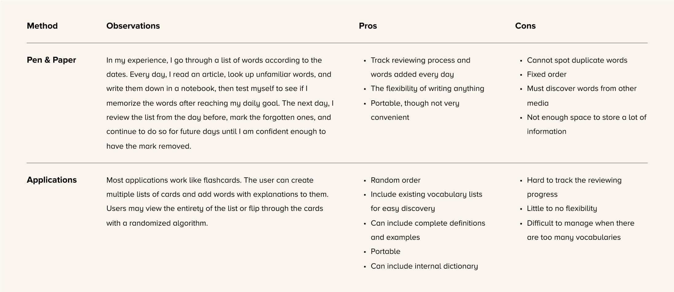
Upon analyzing my existing methods, I realized I wanted the flexibility and customizability of notebooks, and the systematic and algorithmic nature of applications.
Prototype
Supporting Immediate Studies with a Working Prototype
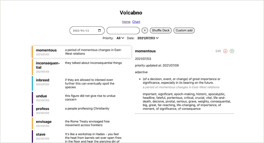
To quickly create an application that would help me in my studies, I forwent designing and immediately moved to developing once I had a general concept with the list of objectives in mind. The prototype was a simple local website made with React.js paired with a Node.js server and a MySQL database. The frontend throwaway code is available in Github.
Objectives
Add and learn new vocabulary
- Add vocabularies through a dictionary API to lessen input time.
- Detect duplicate vocabulary entries.
Memorize and review vocabulary
- Mark vocabulary that were forgotten to place emphasis on them during reviews.
- Include random order of the vocabulary to prevent memorizing words based on position.
- Allow users to add their own notes to increase memorization.
- Customize selection of words to review from.
Reconceptualizing
Building a Cohesive Experience with New Findings
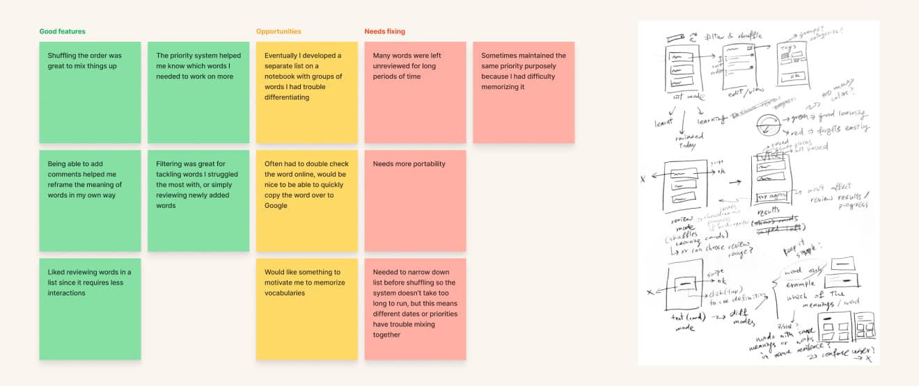
With months of experience using the prototype, I was able to gain some insight into my previous concept. Now that the test was over, I had time to make the new design overall more integrated and tackle some issues I faced using the prototype.
New Challenges
Designing for Long-term Use
Many issues arose after using the prototype for several months as the list of vocabulary grew longer, and new habits were formed from using the prototype.
Motivating The User
During the journey of preparing for English tests, I often found myself unmotivated to open the prototype or learn new vocabulary.
Integrating Different Processes
Over time, I used other tools to complement the prototype. For instance, Google helped me double check definitions or gain more examples, and a separate notebook was kept to group confusing words together.
Reviewing Efficiently and Thoroughly
The prototype’s marking system was insufficient to represent how ingrained the word is in my memory and how difficult it is to remember the word. While I primarily needed quickly reviews of the vocabulary, there were times when I required a more thorough test to address challenging words.
Ensuring Words Get Reviewed
As the list got longer, it became harder to review older words. Even words that I had no problem remembering at the time would eventually be forgotten without refreshing my memory.
Design Outcome
High-Fidelity Prototype
Challenge 01
Motivating the User
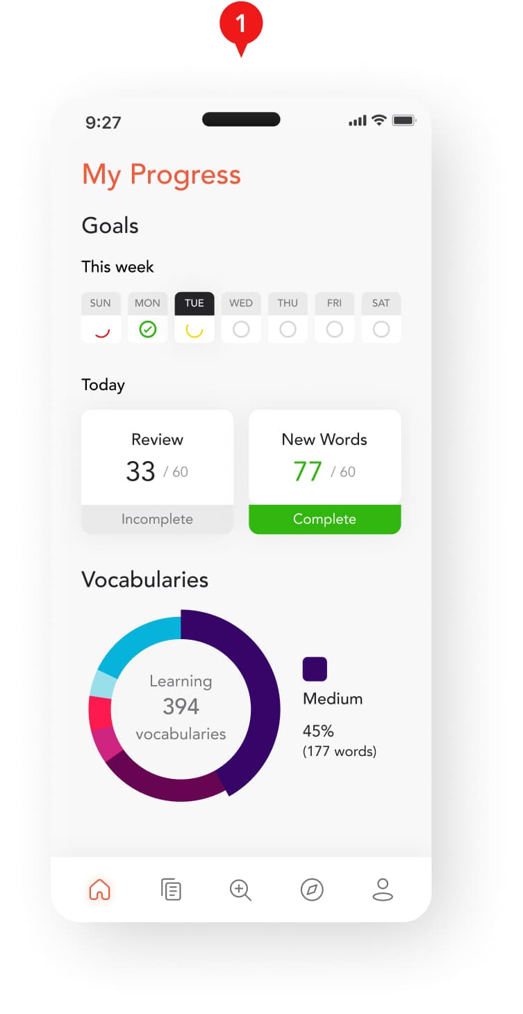
Based on my experience, I wanted to help motivate people with two things that often motivated me: trying to have fun from it, and knowing that I’m close to reaching the goals of the day.
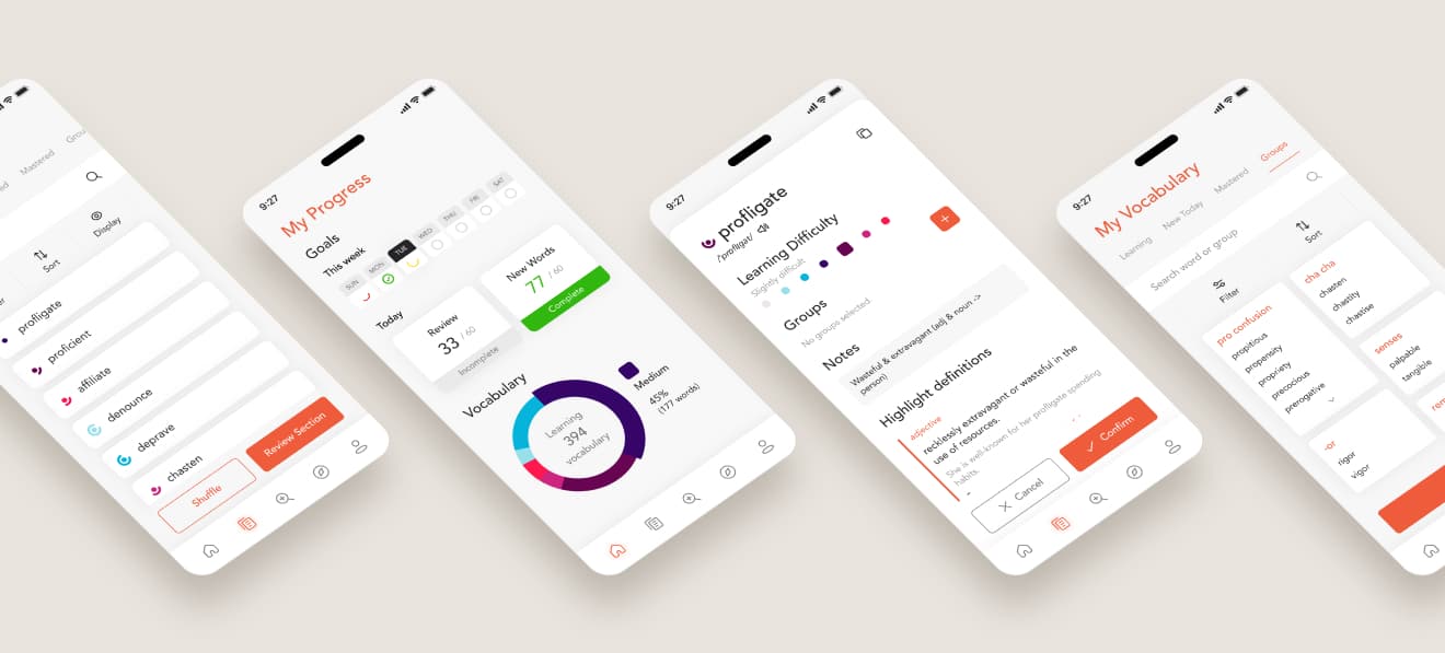
- The home page shows general statistics about user progress in their goals, which users can frequently check on to keep motivated.
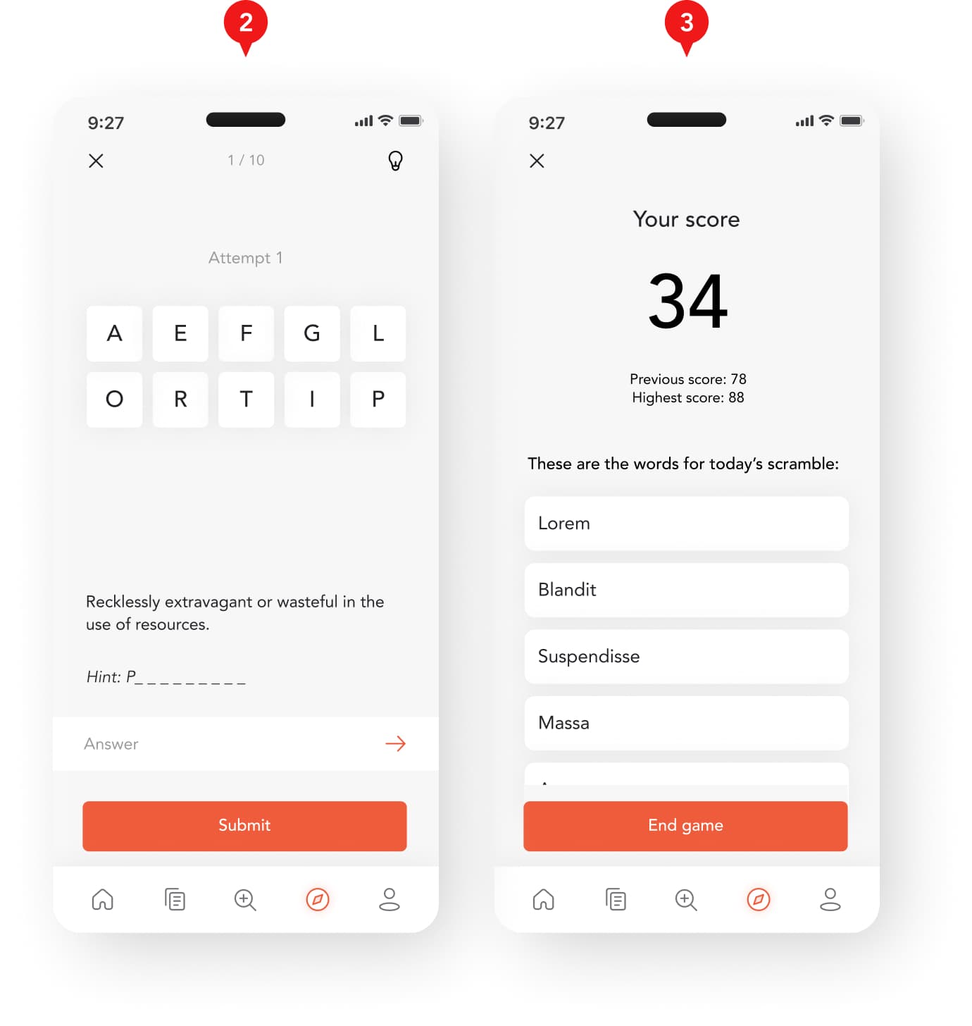
- To retain interest in memorizing vocabulary, users can have fun and discover new words by playing word games.
- Users can easily transition back to the more serious aspects of the task by referring to the list of words the game covers.
Challenge 02
Integrating Different Processes
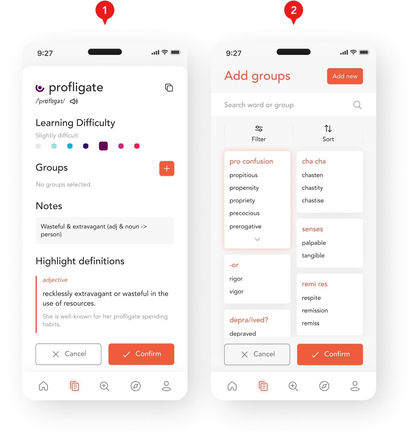
By providing flexibility and convenience to accommodate different use cases, my goal was to ensure users can review words more efficiently and effectively in the same application.
- Users can add notes in their own words, highlight definitions that they’re less familiar with, or copy the word to be used or searched elsewhere.
- Words can also be grouped by meaning, similarity etc. During review, words from the same group may have a higher chance appearing together to ensure users can effectively differentiate between them.
Challenge 03
Reviewing Efficiently and Thoroughly
Reviewing plays a key part in learning vocabulary, and I aimed to improve the review process and effectiveness from my experience with the prototype.
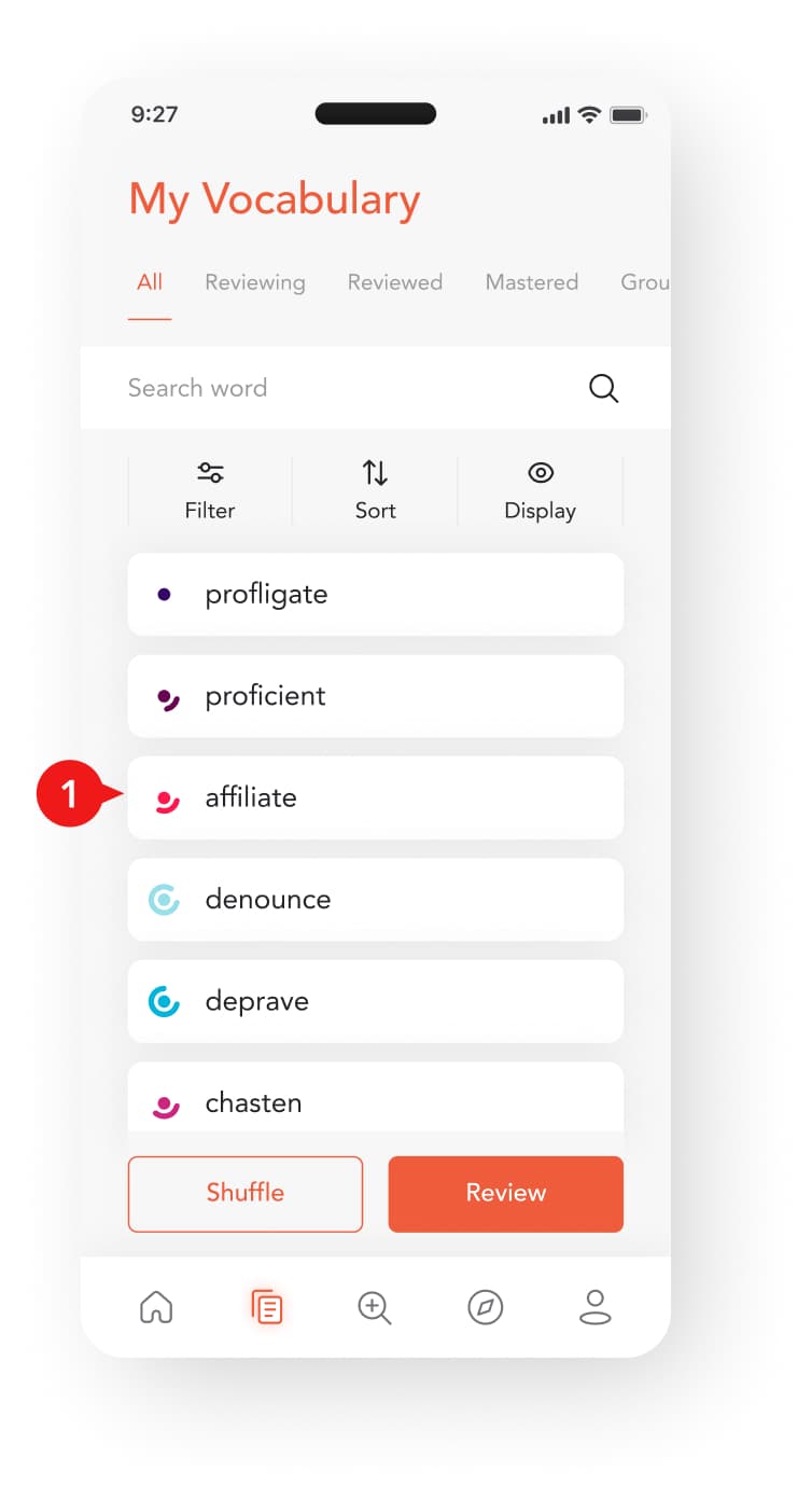
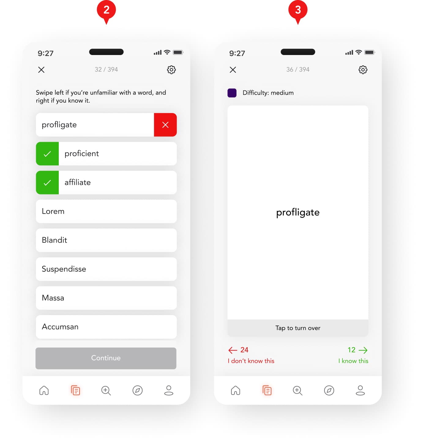
- Each word is marked with a color-coded Learning Difficulty and Learning Progress. The former stands for how difficult the word is for users to remember, and the latter represents how many times the word has been reviewed.
- For a quick test, user can quickly go through a list of vocabulary and determine if they know the word or not.
- For more thorough tests, the user has to go through flash cards, in which a word may appear multiple times depending on how hard the word is for the user.
Challenge 04
Ensuring Words Get Reviewed
The vocabulary list can get very long over time. I explored finding the balance between reviewing everything and limiting the scope to make the review manageable.
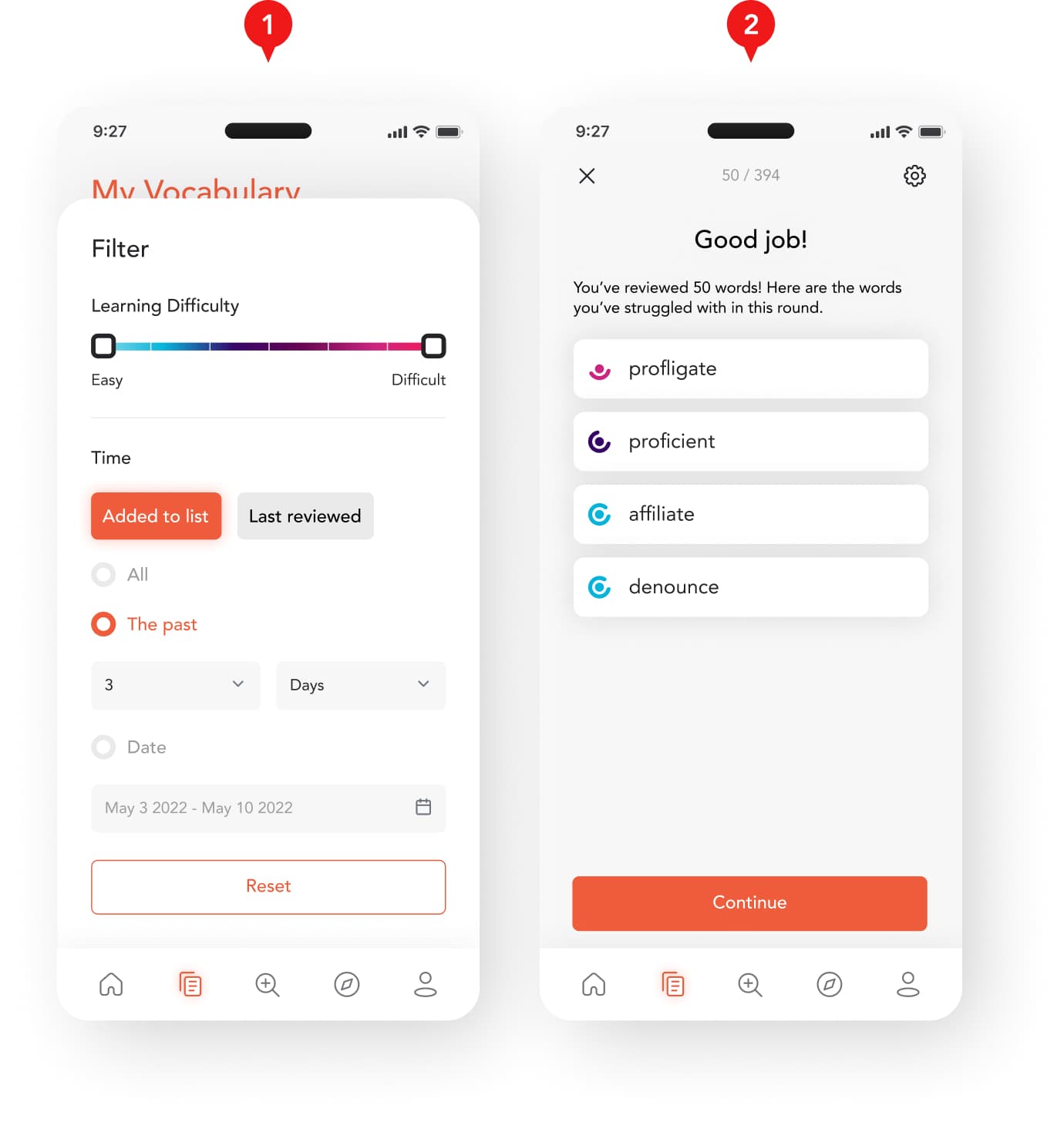
- User can review words based on the current selection from the filter system. The filtration has a lot of flexibility to allow users to adjust the broadness of the selection.
- During review, the selected vocabulary are split into smaller groups to prevent overwhelming the user.
